
Color Theory Tips for Designing Effective Labels
This entry was posted on August 08, 2024 .
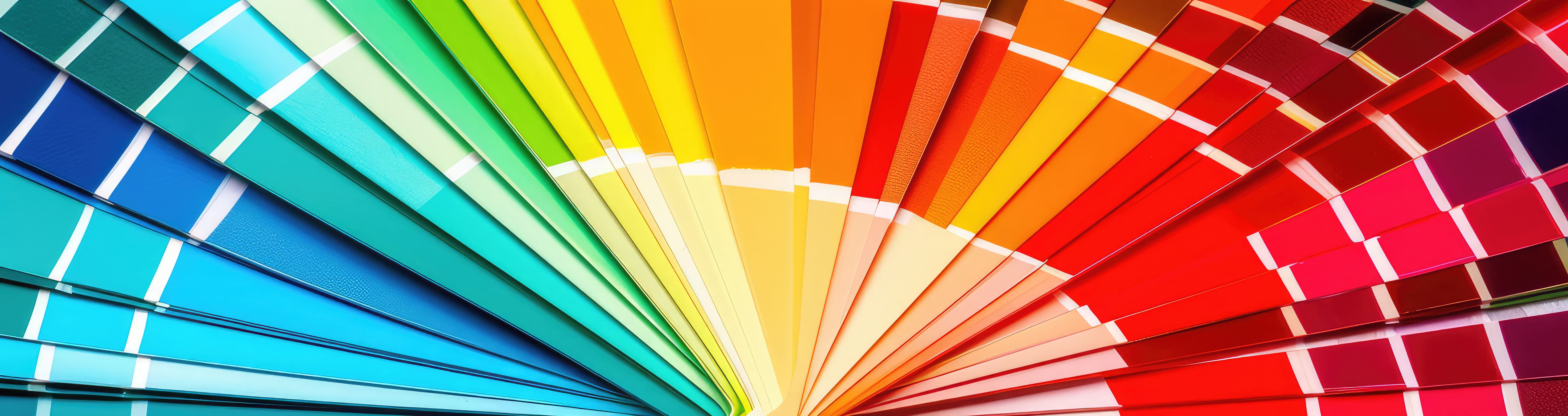
Designing effective custom labels requires a solid understanding of color theory. By leveraging color psychology and selecting the right color combinations, you can create label designs that not only attract attention but also drive consumer behavior.
Make Color Psychology Work To Your Advantage
Color psychology influences human emotions and behavior, making it a crucial aspect of product label designs. The colors you choose for your custom labels can significantly impact consumer purchasing decisions. Here’s a quick guide to colors and the emotions they evoke:
- WHITE: Relaxation, security, lightness.
- PINK: Tranquility, relaxation, sometimes fatigue.
- GREEN: Peacefulness, happiness, relaxation\
- LIGHT BLUE: Comfort, spirituality, relaxation.
- BLUE: Creativity, happiness, safety.
- DARK BLUE & GREY-BLUE: Sadness, security, trust (popular in business).
- RED: Energy, warmth, sensuality, danger
- LIGHT YELLOW: Cheerfulness, optimism, spontaneity, hunger.
- BRIGHT YELLOW: Irritability, danger.
- PURPLE: Introspection, sensitivity, prestige, security.
- ORANGE: Clarity, vitality, hunger.
- BROWN: Relaxation, passivity, security, vitality, sometimes depression.
- BLACK: Virility, rationality, stability, sorrow.
Think about the emotions you want to evoke in your target market and incorporate these colors into your custom label designs.
Pair Text & Background Colors Together in Legible Combinations
Choosing legible text and background color combinations is essential for readability and aesthetic appeal. The key to successful pairing is contrast—both in lightness and darkness (value) and in hue. High contrast minimizes eye strain and enhances legibility. Complementary hues, which are opposite each other on the color wheel, provide the greatest contrast.
Here’s a format to display the text and background color pairings:
| Text Color | Background Color | Legibility |
| Black | Yellow | Most legible |
| Black | White | High |
| Yellow | Black | High |
| White | Black | High |
| Blue | White | High |
| White | Blue | High |
| Green | White | High |
| White | Green | High |
| Red | White | Medium |
| White | Red | Least legible |
Use these combinations to ensure your custom labels are easy to read and visually appealing.
Take Advantage of Free Online Tools That Simplify the Process of Choosing a Color Scheme
Choosing colors for your custom labels doesn’t have to be tedious. Numerous online tools can help you create the perfect color scheme:
- Kuler (Adobe Color): Create your own color schemes or explore popular schemes created by others.
- COLOURlovers: Find color palettes based on keywords and monitor emerging color trends.
- ColorBlender: Tweak your color palette by adjusting red, green, or blue channels. It's intuitive and doesn't require registration.
These tools can help you find harmonious color combinations that enhance your custom label designs.

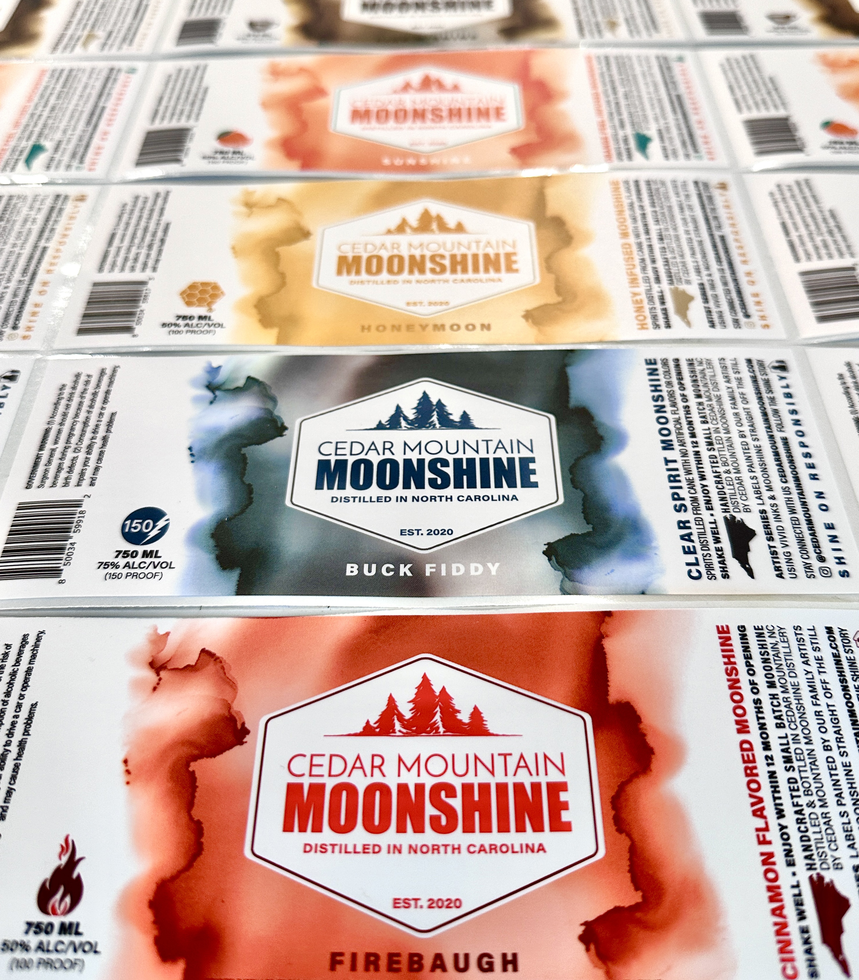
Send Your Digital Label Printer CMYK Artwork Files
CMYK (Cyan, Magenta, Yellow, Black) is the standard color mode for printing full-color images. Most digital printing presses, including those at Lightning Labels, use CMYK. Here’s why sending CMYK files is crucial:
- Accuracy: Sending files in RGB (Red, Green, Blue) requires conversion to CMYK, which can cause color shifts.
- Detail: The "K" in CMYK stands for the black "key plate" used in traditional printing for detail. Although digital printing doesn’t use plates, the CMYK model avoids confusion with the RGB model used for screens.
If you’re concerned about how colors will appear in your printed labels, take advantage of Lightning Labels' free “press proof” offer. This lets you see the exact colors before your custom labels go into production.
FAQ: Color Theory Tips for Labels
What is color psychology and why is it important for label designs?
Color psychology studies how colors affect human emotions and behavior. It’s important for label designs because the right colors can influence consumer purchasing decisions and enhance brand perception.
What are the most legible text and background color combinations?
High-contrast combinations like black on yellow, black on white, and yellow on black are the most legible. Complementary colors also provide high contrast, making text easier to read.
Why should label artwork files be sent in CMYK format?
CMYK is the standard color mode for printing, ensuring accurate color reproduction. Sending files in CMYK prevents color shifts that can occur when converting from RGB.
How does color contrast affect label design?
Color contrast affects the readability and visual impact of a label. High contrast between text and background colors makes the text more legible and reduces eye strain, enhancing the overall effectiveness of the label design.
Related Products
-
 Custom Labels
-
Bath & Body Product Labels
-
Custom Candle Labels
-
E-Juice Vape Labels
-
Variable Label Printing
-
Health & Nutraceutical Product Labels
-
Custom Beverage Labels
-
Custom Bottle Labels
-
Custom Lip Balm Labels
-
Home & Garden Product Labels
-
Custom Warning & Safety Labels
-
Perfume Bottle Labels
-
Bumper Stickers
-
Custom Prop 65 Warning Labels
-
Extended Content Labels
-
Custom CBD Labels
-
Barcode Labels
-
QR Code Labels
-
Honey Jar Labels
-
Tea Labels
-
Custom Pet Product Labels
-
Custom Hemp Labels
-
Canning Labels
-
Custom Hand Sanitizer Labels
-
Custom Beer Labels
-
Sustainable Hemp Label Material
-
Blank Labels
-
Embossed Labels
-
Custom Hot Stamp Labels
-
Custom Stickers
 Custom Labels
  Custom Beverage Labels
  Custom Lip Balm Labels
  Custom Warning & Safety Labels
  Perfume Bottle Labels
  Bumper Stickers
  Custom Prop 65 Warning Labels
  Custom Stickers