-

List of Products with Prop 65 Warnings (By Industry)
Continue reading »We break down which everyday products commonly carry a Prop 65 warning and explains what the label means for consumers and businesses.
-
Maximizing Compliance and Transparency: The Role of Custom Barcode Labels in the Cannabis Industry
Continue reading »Selling products in the cannabis industry, whether for medical or adult-use purposes, requires adherence to stringent regulations and legal standards. Despite the challenges, many entrepreneurs find the thriving cannabis market worth the effort. While specific regulations vary by state and product, certain common features, such as barcode labels, are essential for compliance.
-
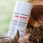
Why Good Labeling Matters at the Farmers Market
Continue reading »Stand out at the farmers market with label designs that build trust, reflect quality, and hold up through heat, handling, and repeat buys.
-
2025 FDA Food Labeling Requirements: Stay Compliant with New Guidelines
Continue reading »From ingredient lists and allergen disclosures to recent updates like structured product labeling, FDA food labeling requirements are essential. Learn about industry-specific guidelines and how to ensure your packaging stays compliant to avoid fines or product recalls.
-
How to Create Custom QR Code Labels That Actually Work
Continue reading »Ensure your QR code labels scan flawlessly with practical tips on design, sizing, materials, and smart placement for reliable performance across products.
-
How to Choose the Right Lamination for Your Product Labels
Continue reading »We break down the key types of label lamination and helps you choose the best finish to match your product’s durability needs and brand style.
-
What is the Best Way to Print Sticker Labels for My Beers?
Continue reading »Get practical insights on choosing the right materials, printing methods, and design strategies to create standout, durable beer labels that match your brand and brewing goals.
-
California Proposition 65 for Clothing: What Apparel Businesses Need to Know
Continue reading »Explore California Proposition 65's impact on the apparel industry, outlining compliance strategies, potential risks of non-compliance, and the benefits of proper labeling.
-
How to Create Custom Wine Labels That Pop
Continue reading »Create custom wine labels that stand out with bold design, tailored messaging, and professional finishes to perfectly represent your wine and brand.
-
Proposition 65 Exemptions: What Businesses Need to Know
Continue reading »Find out which businesses are exempt from Proposition 65 warnings and how to stay compliant without unnecessary labeling.