-

Making Sense of Die Cutting for Custom Labels
Continue reading »Die cutting is like using a cookie cutter to shape your product labels. Imagine you have stickers for your products, and you want them to be more than plain old squares. With die cutting you can make all sorts of shapes like ovals, circles, or even something more unique. By using a metal tool, die cutting can precisely cut your labels into the shapes you desire. It's a way to make your products pop and catch people's eyes when they're out shopping.
-
What Makes a Supplement Label Stand Out on the Shelf?
Continue reading »A clear, compliant, and durable supplement label can make all the difference in capturing attention and building trust with health-conscious buyers.
-
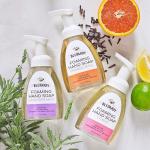
How to Print High-Impact Labels for Home Fragrance and Cleaning Brands
Continue reading »This blog highlights how durable materials and strategic design can elevate home fragrance and cleaning product labels to stand out while withstanding daily use.
-
Hot Weather, Cool Labels: Custom Beverage Packaging That Stands Out
Continue reading »Get practical tips and material recommendations to ensure your custom bottle labels stay vibrant and intact through summer heat, moisture, and handling.
-
Custom Cosmetic Labels That Sell: Tips for Beauty Brands
Continue reading »Create cosmetic product labels that stand out, stay compliant, and support your brand across every SKU.
-
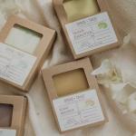
Cozy Up Your Packaging: Fall-Inspired Soap Label Ideas for Autumn Launches
Continue reading »This blog shares creative fall soap label ideas and material tips to help brands evoke seasonal warmth and boost shelf appeal.
-
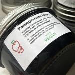
Farmer's Market Products: Choosing Durable, Moisture-Resistant Label Materials
Continue reading »This guide highlights the best water-resistant label materials for farmer’s market products, ensuring your packaging stays durable and attractive in any booth condition.
-
What is BOPP Label Material and When Does It Work Best?
Continue reading »Choosing the right custom label for tapered containers can be challenging. Discover helpful tips and expert advice on label sizes, shapes, and application techniques for your packaging needs.